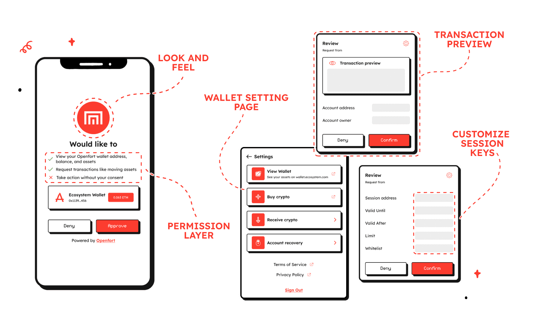
Craft and customize your wallet
The Fort ecosystem wallets come with a default set of screens for authentication, session key confirmation, sign typed message, configuration, and transaction confirmation. These screens are designed to be customizable to fit your brand and user experience. Openfort provides helpers to the most popular frameworks to make it easier to integrate the ecosystem wallets.
The default Client SDK expects the following routes to exist in your wallet UI:
| Route | Description |
|---|---|
| /sign/personal-sign | personal_sign |
| /sign/eth-sign-typed-data-v-4 | eth_signTypedData_v4 |
| /sign/eth-send-transaction | eth_signTransaction |
| /sign/eth-request-accounts | eth_requestAccounts |
| /sign/wallet-show-calls | wallet_showCallsStatus |
| /sign/wallet-send-calls | wallet_sendCalls |
| /sign/eth-grant-permissions | wallet_grantPermissions |
| / | Loading screen |
React SDK#
When adding the React components to your App, there are two places where the components can be customized. All but one of the theme customizations options are passed through to the Fort Tailwind plugin in your tailwind.config.js file.
In your wallet UI project, after installing the @openfort/ecosystem-js package to get started with the React SDK. It will be then available from @openfort/ecosystem-js/react.
You can check all the available components in the React SDK reference.
Use the live ecosystem customization tool to get your custom theme and components.
Colors#
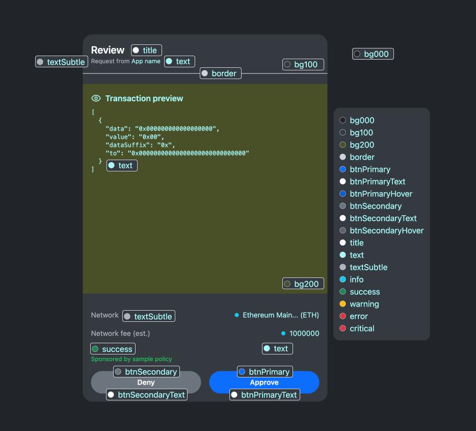
The available colors are:
Background colors
bg000- Lightest background colorbg100- Light background colorbg200- Medium background color
Border colors
border- The color of borders
Button colors
btnPrimary- The color of the primary buttonbtnPrimaryText- The text color for the primary buttonbtnPrimaryHover- The hover color for the primary buttonbtnSecondary- The color of the secondary buttonbtnSecondaryText- The text color for the secondary buttonbtnSecondaryHover- The hover color for the secondary button
Text colors
title- The color for title texttext- The main text colortextSubtle- The color for subtle or secondary text
Status colors
info- The color for informational elementssuccess- The color for success messages or indicatorswarning- The color for warning messages or indicatorserror- The color for error messages or indicatorscritical- The color for critical messages or indicators
These color variables can be used to customize various elements of the UI as shown in the image. For example, the main content area uses bg200, while the outer container uses bg100. Text elements use title, text, and textSubtle accordingly.
The button styles (btnPrimary, btnSecondary, etc.) are applied to the "Approve" and "Deny" buttons at the bottom of the UI.
Core SDK#
The Core SDK is the package that you will use to receive and send communication with the Client SDK. This package includes all the necessary functionality in order to onboard your users to blockchain with non-custodial wallets.
This are the available Method Types that will be sent from the Client SDK and that you can subscribe to:
| Method | Type |
|---|---|
| ETH_SEND_TRANSACTION | 'eth_signTransaction' |
| ETH_TYPED_MESSAGE_V4 | 'eth_signTypedData_v4' |
| PERSONAL_MESSAGE | 'personal_sign' |
| WALLET_GRANT_PERMISSIONS | 'wallet_grantPermissions' |
| WALLET_SEND_CALLS | 'wallet_sendCalls' |
| WALLET_SHOW_CALLS_STATUS | 'wallet_showCallsStatus' |
| ETH_REQUEST_ACCOUNTS | 'eth_requestAccounts' |
You can check all the available components in the Core SDK reference. You can react to receiving this events by subscribing to them and executing the necessary logic in your app, like rendering a confirmation screen or sending the transaction to the blockchain.